Earth Cycle rebranding

Mark Bailey • September 4, 2025

In the early part of 2025 we worked with Cameron Lewis at The Woodhorn Group and Emma Cooper at Recenseo to create a new visual brand and kit for Earth Cycle - one of the group’s B2C brands. 

We had already worked on the group’s well received and successful new brand Woodhorn Farm so it was great to be recalled to continue with the rebranding process of another of their brands.
The old Earth Cycle logo, with its vibrant colour palette, detailed globe, and three-dimensional recycling arrows, appeared clichéd, visually cluttered and overly intense, potentially reducing readability, adaptability, and memorability compared to more minimalist and iconic designs. It also has little in its design aesthetics that linked it to other Woodhorn Branding.

There was a requirement to tie the new branding in with the previous branding work for Woodhorn Farm and a future rebrand of the Woodhorn Group.


There was a requirement to tie the new branding in with the previous branding work for Woodhorn Farm and a future rebrand of the Woodhorn Group.


The final logo incorporates fonts and a curve from the Woodhorn Farm logo, which references the rolling South Downs where the farm and group are located.
Leaf paterned blocks of colour

We developed a colour palette that continued with the natural subtle tones developed for the Woodhorn Farm brand but pulled out some bright highlighting colours too.


A subtle leaf pattern was created and applied to 4 of the palette colours. This could be used in the new website and in packaging for future product lines (tissue paper perhaps).
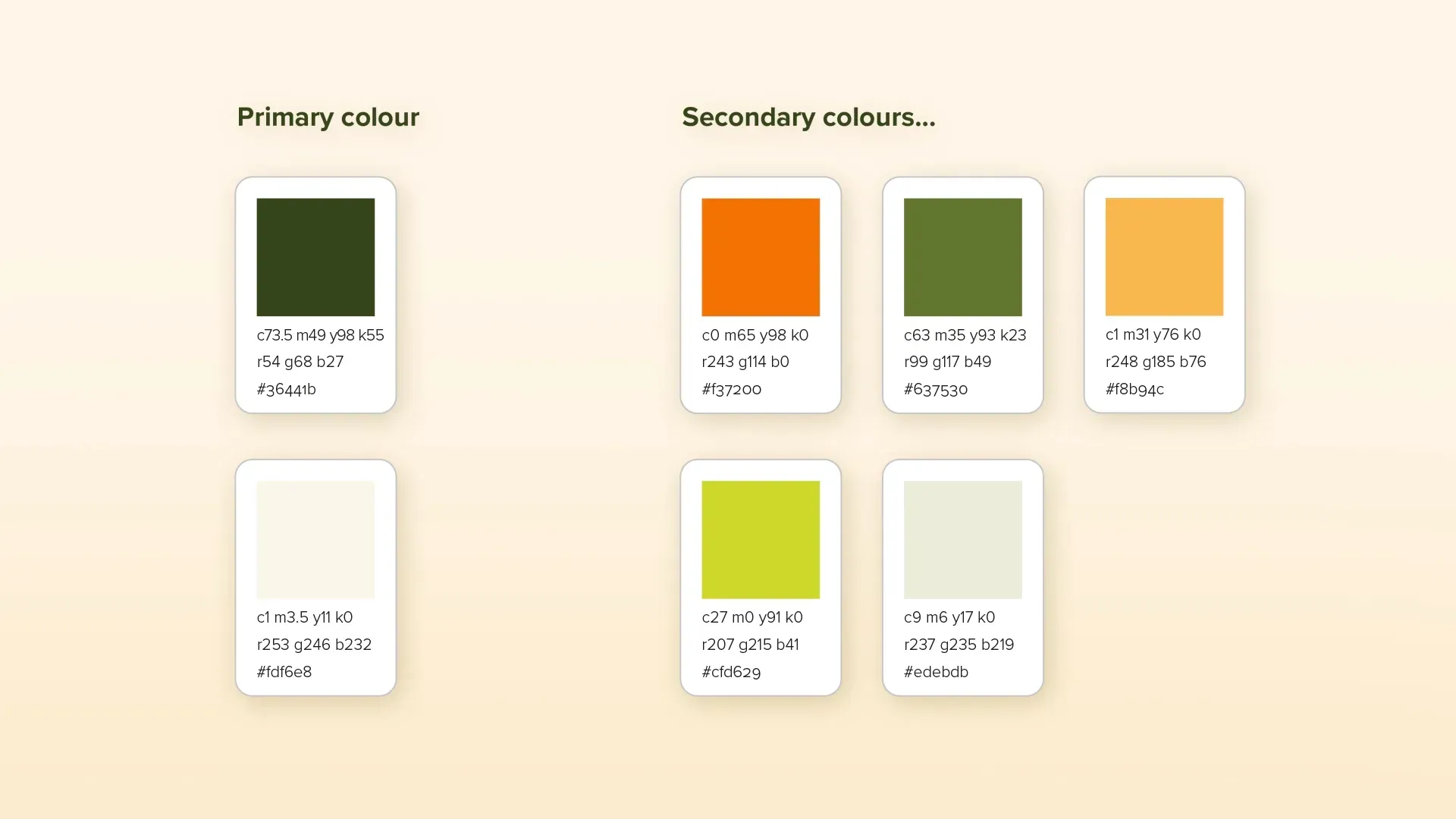
Colour palette for the Earth Cycle brand

Although we weren’t designing any specific marketing communications, a need to sense proof what we were proposing was of course necessary and developing a look for the photographic imagery helped and was extended by the web development team - Superrb.
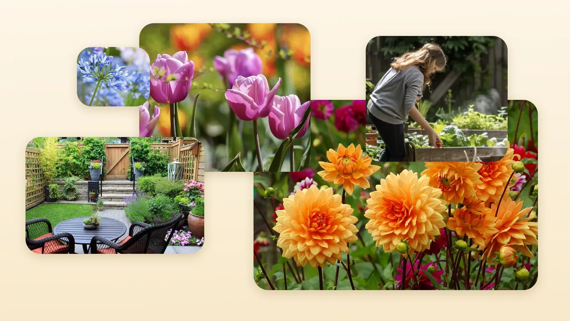
Illustrations for the Earth Cycle brand

This was complemented with some simple, playful illustrations that could support areas to give them a lift where required. We also developed a suite of bespoke icons.
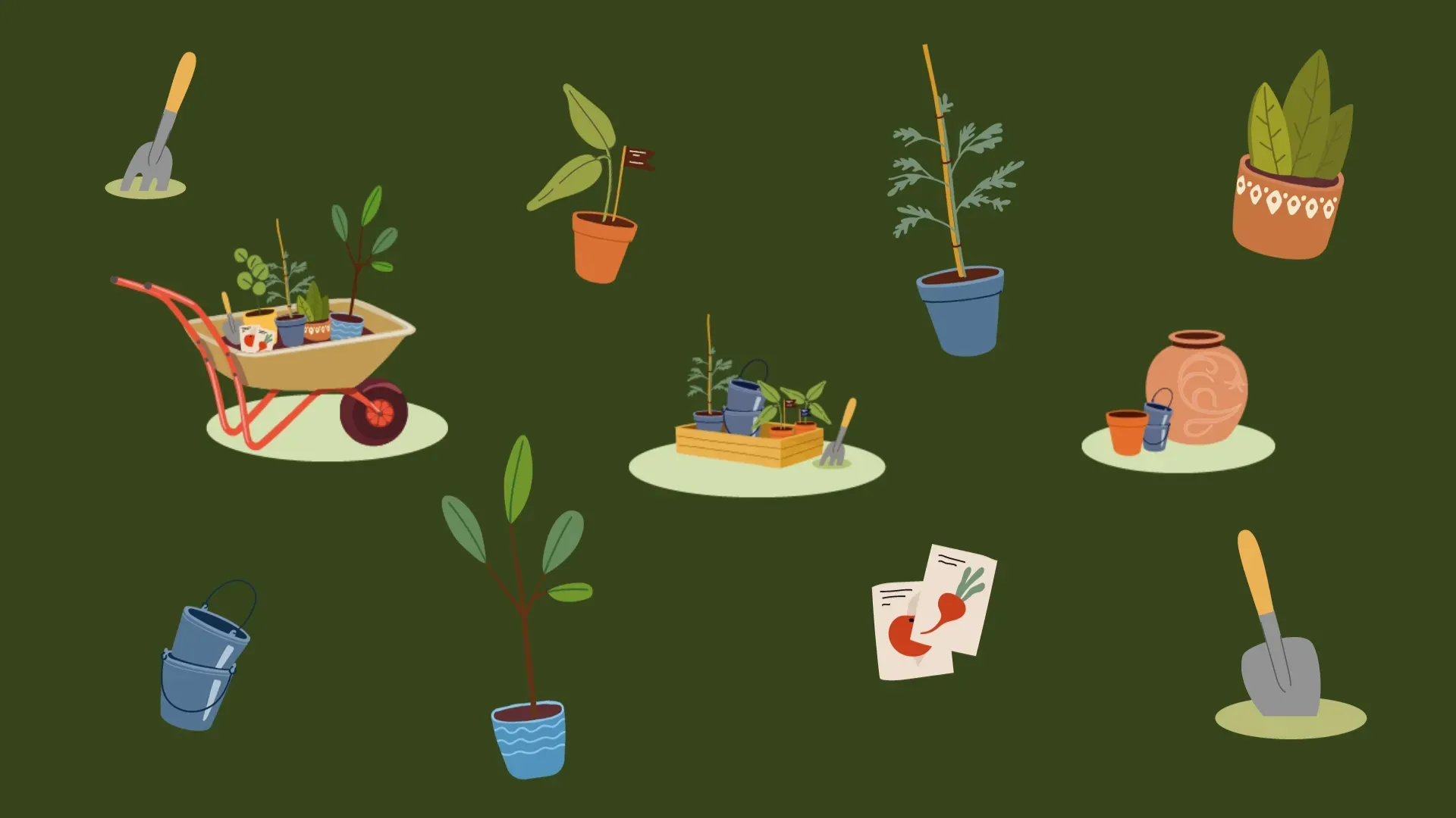
Illustrations for the Earth Cycle brand

This project was another great example of how Baileycs slots into a business to provide creative support as part of a client’s team of suppliers. Emma at Recenseo handles the group's marketing, and Superrb were brought in to create the new ecommerce website.


You can see our branding in action in the new website - earthcycle.co.uk


We'd love to help with your creative requirements.

From illustration to 3D animation, visual branding to design.


Get in touch  hello@baileycs.com


By Mark Bailey July 16, 2025
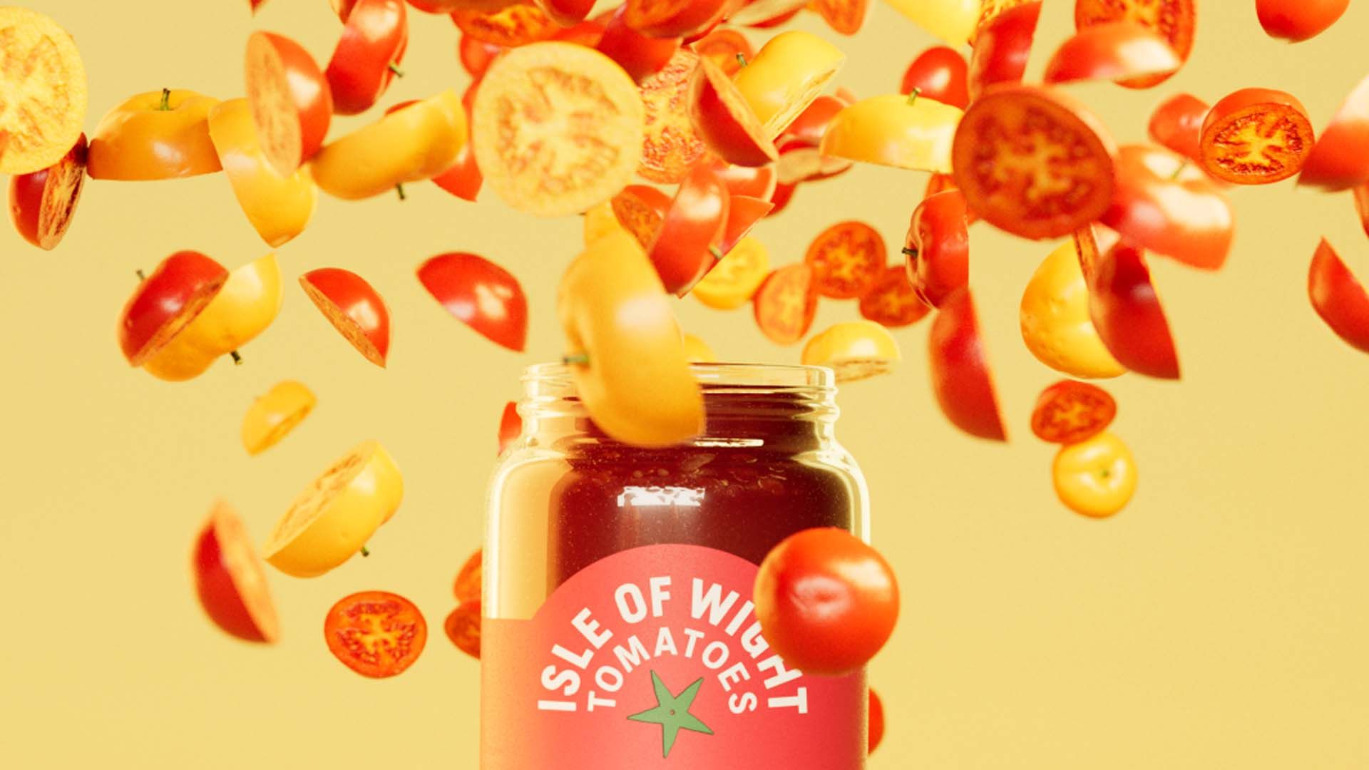
Recently I saw some beautiful imagery created for a local tomato producer.
Illustration of construction workers Sandown and Yaverland sea defences
By Mark Bailey February 25, 2025
This is the second project that we've worked on with the Environment Agency. After a successful set of illustrations were created for the Pevensey Bay to Eastbourne Coastal Management Scheme, we were approached by project lead, Emily Webster, regarding the proposed sea defence improvements for Sandown and Yaverland. Emily and the team required two main illustrations and several cameos. These would be supplied to their design team to create public consultation material - posters, online assets and other communication assets.
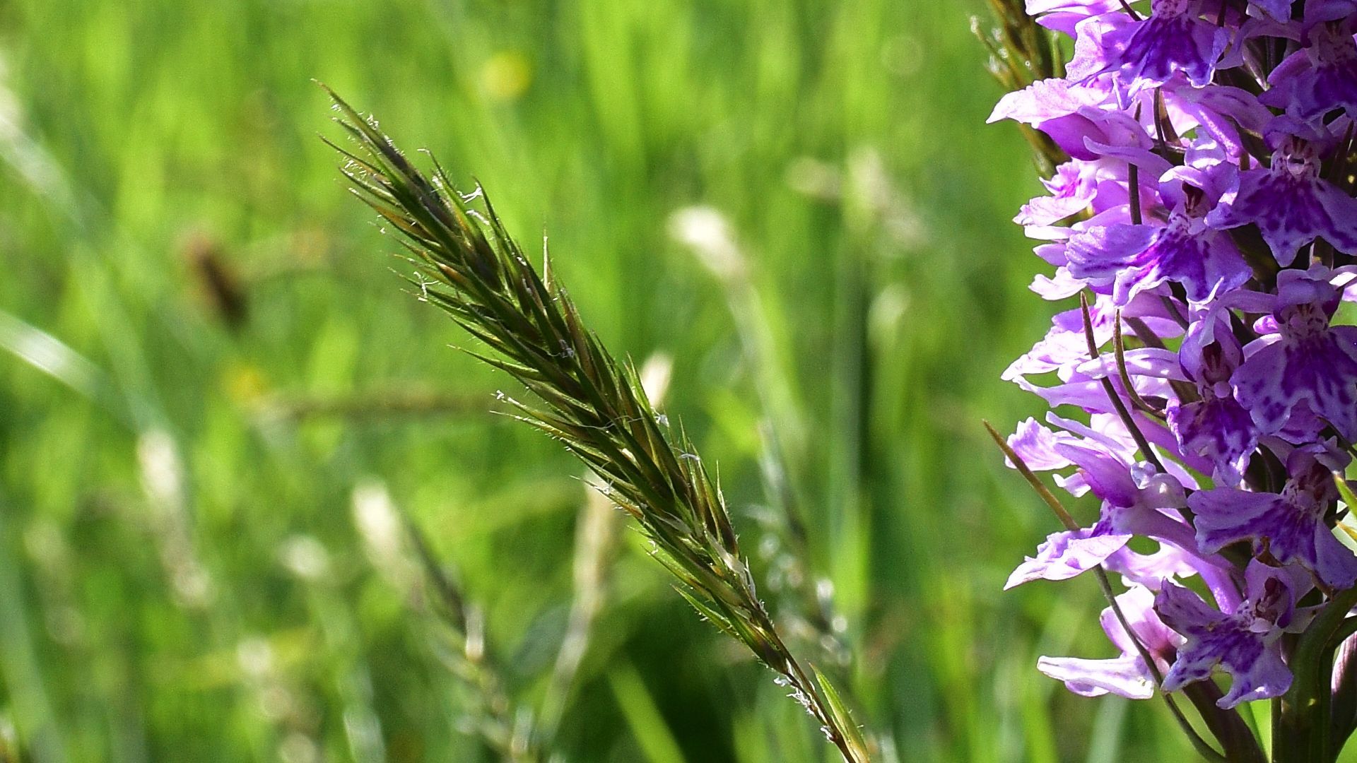
Common spotted Orchid flowering in an uncut lawn in the summer sun.
By Mark Bailey June 7, 2024
The Baileycs office is lucky to be situated in lovely gardens with a huge variety of flora and fauna. The lashings of rain we’ve had means it’s been a bumper year for nature’s colourful spring and early summer carnival.
Woman dressed in cyber costumes dance on stage with pink stage lights shining down on them
By Mark Bailey May 28, 2024
The Futura Girls don their cyber cossies to woo the crowds and dance the night away.
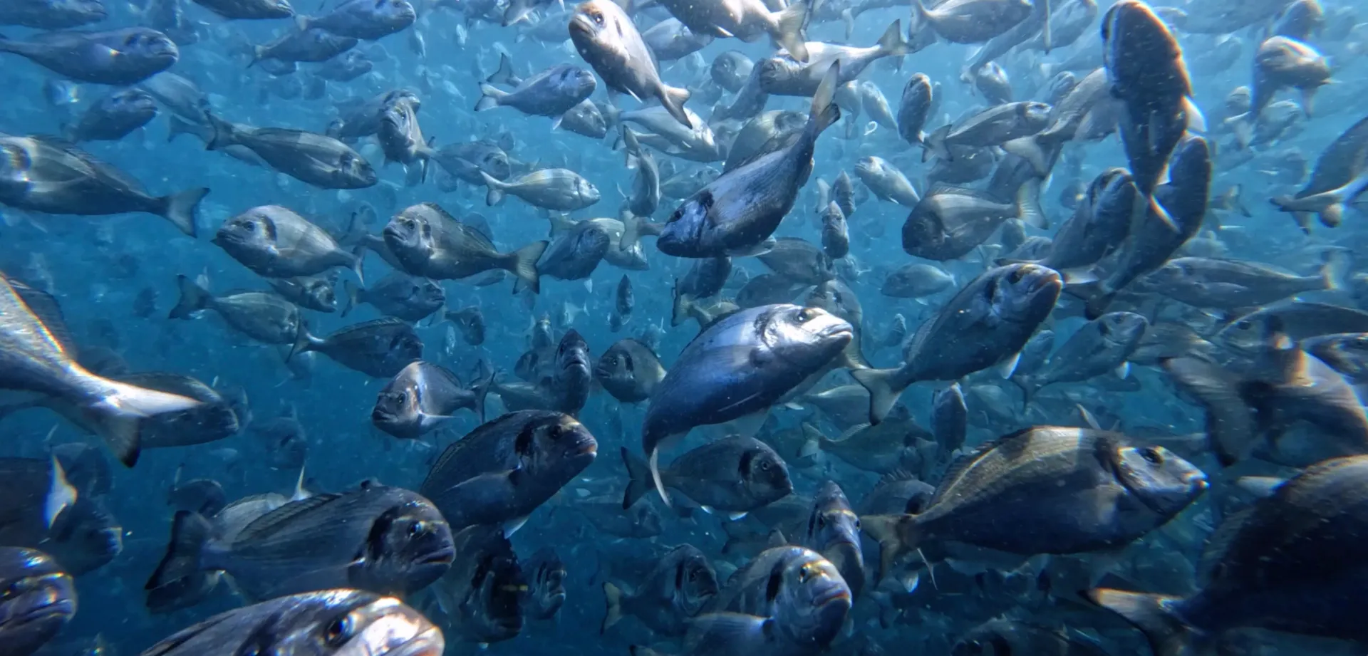
Underwater shot of a Sea Bass shoal feeding on an ASC approved farm.
By Mark Bailey March 13, 2024
Over the past couple of years BAILEYCS has had the pleasure of providing creative support to The Aqua Stewardship Council (ASC).
A clip from Open the Doors by BAILEYCS showing a suited figure doing a high agressive cick into came
By Mark Bailey February 12, 2024
This is my latest bit of animation - Open the Doors. In the quest to increase my 3D knowledge base I create a lot of imagery and animations that rarely see the light of day so sometimes I dust it off and and pull it all together into some sort of story. Hope you enjoy it!
An adviser leans into an operative in conversation as they look at a screen.
By Mark Bailey January 23, 2024
Recently our client, the IOW Group, was looking to expand the number of partners they deal with to help promote and sell their products. They asked us to look into marketing assets to support this activity. There are several issues with partner programs. Businesses can waste a lot of time with prospective partners only to find that they aren’t suitable. This can be for a number of reasons: they aren’t established, they promise the world but don’t have the staff or funding to provide the required support for installation and support for the products, or in real terms, they simply aren’t motivated enough to sell the product. So, the process had to promote the new program and be upfront about the requirements necessary to become a partner.
By Mark Bailey January 8, 2024
We had the pleasure of working with Sarah Martin and Andrew Walker at the Environment Agency in Chichester and were tasked with creating 8 to 10 images that would be used as part of a wider presentation to help show the public different options and choices that could help protect properties along the Pevensey Bay to Eastbourne stretch of coastline. Initial illustration reference provided by The AE were more traditional (a more typical arch/vis water colour look) although they were happy to go with something different. We pulled together an initial look and feel that was more contemporary in approach which was liked and helped get the project moving. Rough sketches were provided by Andrew and along with our own research initial roughs of each illustration were submitted and amended before creating the final illustrations. 
Woodhorn Famr Branding and marketing creative
By Mark Bailey August 8, 2023
Working with The Woodhorn Group from March 2022 we were asked to create a brand for their new milk vending business that will now be going live September 2023.
By Mark Bailey November 7, 2022
It was great to catch up with MSP again earlier this year and create some simple, engaging animations of 6 key messages.
More Posts